|
When I went to Baisoara, the media camp a few months ago, I started filming a few videos after the sun was down, without any reason. Then I found myself encaptured of the beauty of everything around me, from the colors to the textures and the sounds. Unfortunately, the SD card didn't work when I put it into my laptop, so after some time I figured it out and finally got my footage. I felt so happy to be able to finally edit in Final Cut Pro what I filmed. I stayed about four hours editing and time passed me by. The last thing I had to do is choose a name for it, and 'crude' was the one which sounded the best for me, as it sets off the right atmosphere. Afterwards I uploaded it on Youtube and on my Instagram account. On Youtube I already got a few likes and comments! Overall it was a great experience from which I gained skill and knowledge. Hope you enjoy this montage as much as I did.
0 Comments
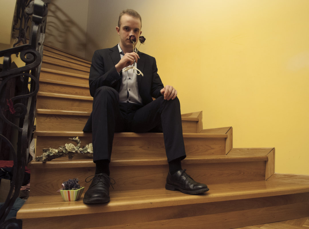
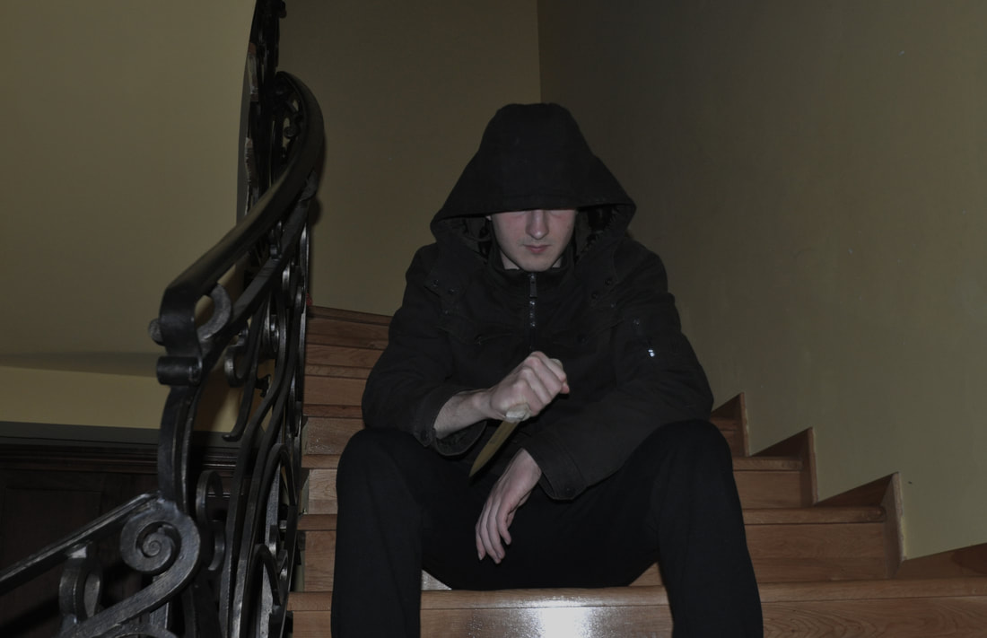
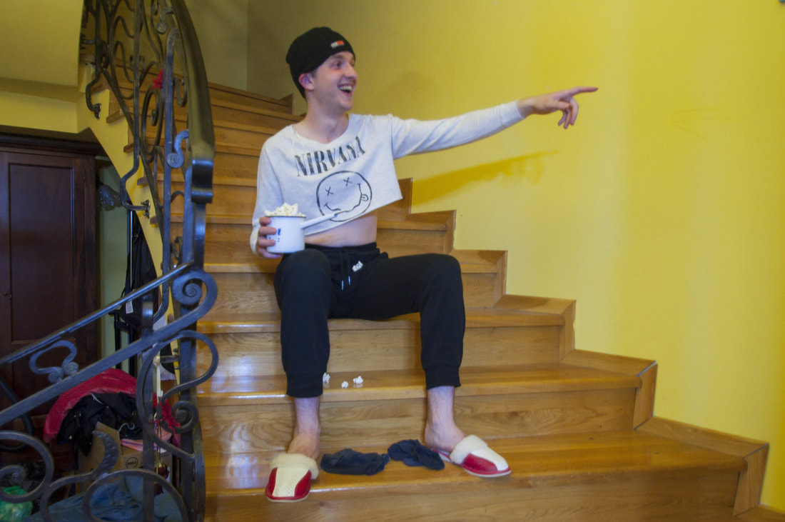
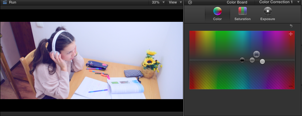
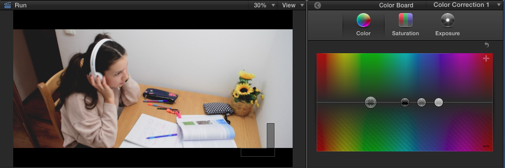
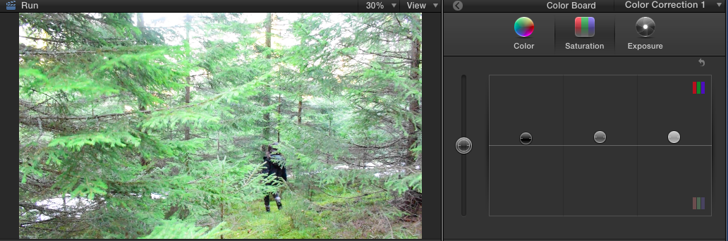
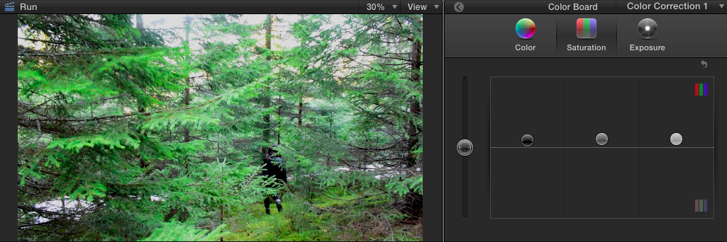
Our teacher made us aware of how important lighting, colors, body language and practically everything that an image is composed of, in matters of the genre is conveys, therefore I asked my brother to pose for me for three different genres: romantic, horror, and comedy. It was very fun, I got quite creative when choosing the props and had a good laugh when he posed for the comedy genre. Apart from this task, I thought I would develop my editing skills even more and took a picture and edited it in three ways, from my initiative, to see how well I would do. I took a picture off the internet and created different moods for it. The first one would be a reality-show, second would be drama, and finally horror. What my artistic eye feels is that many pictures have a 'commercial' feel to them, not looking artsy at all, and maybe they're not intended to. What I thought, on a Sunday morning, was to take pictures that don't appeal to my critique and make them look cinematic, like they're shots from a movie, by the help of a YouTube tutorial and my personal preferences. I used Adobe Photoshop to edit them, so by doing this, I also developed my skills in using this program. This is what came out, and I'm very satisfied with the outcome. I asked my brother if he could be the model for my small photoshoot and he happily (at least that's what he told me) agreed. All pictures were taken on an iPhone 6S, in my room, in front of my black wall. Moreover, they were all edited with photoshop. The first picture is consists in my brother holding a silver pineapple decoration. When I was playing with the contrast tool in photoshop, I increased it almost to the highest amount and liked what I saw. I love how the neon orange-red highlights on the pineapple and his hand add a surreal yet beautiful touch. I was also fascinated by how the lights were reflected from the pineapple. The second picture is black and white, with a faded effect. I'm mesmerized by the beautiful contrast of the black clothes and background with the white wall reflected in the mirror. Initially, I told my brother to hold the mirror in any angle, but when it reflected the minimalistic, simple white corner of my room, I quickly took a picture. Now, this could be interpreted in many ways, but my view on it is that he is a truly complex person but only portrays himself blandly in order to omit looking different from the others, society, the mass. The third picture is unique in the sense that the photographer (me, in this case) appears in it in a distorted, fish-eye looking way. I adore the contrast between the absolute black (his t-shirt), his hands and the candle holder that he keeps in his hands. The last picture has reached the top of my favorite pictures captured by me as it transmits a pure, loving atmosphere. When I look at it, I imagine a young man waiting for his lover with a gorgeous bouquet. In addition, I'm metioning yet again the contrast between the wall and the flowers; this accentuates the beauty of the flowers. Overall, I declare this photoshoot a very successful one. I learnt to use the objects around me, make them look beautiful and use my creativity. During my stay at Baisoara, I managed to make three videos, one montage presenting the camp, one montage (Crude) and this other one, called 'Run', which has a storyline. It's about a girl at around age 14, who has an unhealthy relationship with her mother after which she wakes up in the forest, under the influence. This drives her to see a hooded man in the forest, after which she wakes up again in her room, very confused and distressed. The end shows her waking up one more time, leaving a an open ended plot. A few things I did as to editing were adding my recorded voice over the videos, as I didn't tell my actress playing the mom to say anything, just to act out. Then, I color edited the clips two times. At first it was at the beginning of the year, and I wasn't aware of any techniques of color grading, after which I came back to my project recently and re-edited it. Before, I added a lot of purple to the shot which made it look unnatural, and the exposure was too high. 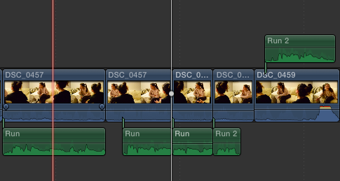
For the shot where the girl wakes up in the forest, I used the 'earthquake' effect. 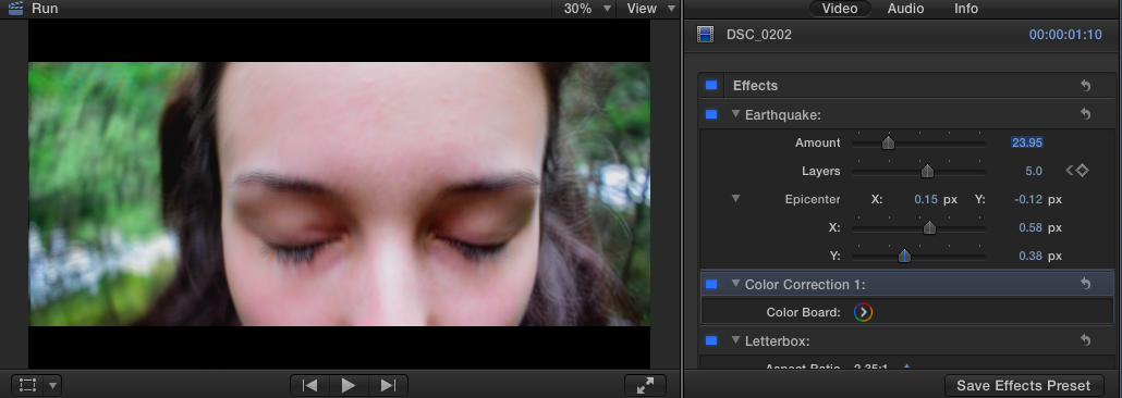 For the forest scenes, I upped the saturation, to show how the girl sees the world around her, as the substances she took heightened her vision.
A few weeks ago I went to a media camp in Baisoara, a town close to my city, with my teacher and a lot of other students where I encountered beauty all around me that I had to capture. The overall experience helped me a lot develop my photography and especially videography skills. At this time I had only started to use Final Cut Pro. I played around with the brightness and colors of the clips, adding a mild hue of purple to create a fantasy-like feel. The songs I used I've been loving for a long time and represent a deep sentimental value but also go with the theme of the montage, hence why I decided to use them. A short movie about summer 2017. The quality isn't so good as all the clips were taken without the purpose of being in a video. Better quality is to be expected! These pictures were taken when I was relaxing at the countryside and these beauties caught my eye. What I love about these images is the contrast between the yellow-ish oranges and the green tones, creating a pleasing and captivating look. In the first picture I wanted to capture the natural beauty of the sunflower and it's small details that add texture and depth to the picture. In the second one I used the grain setting to create a vintage look. Moreover, I wanted the flowers to occupy only third of the picture because of the 1/3,2/3 rule, but also because my intent was so portray them as small compared to the big sky. The third picture captures the flowers at a more human-eye level, adding realism to the composition. Lastly, the final picture wants to show the multitude of flowers and the gorgeous shade of yellow, adding a ray of positivity to the gloomy day. |
Archives
February 2018
Categories |
 RSS Feed
