|
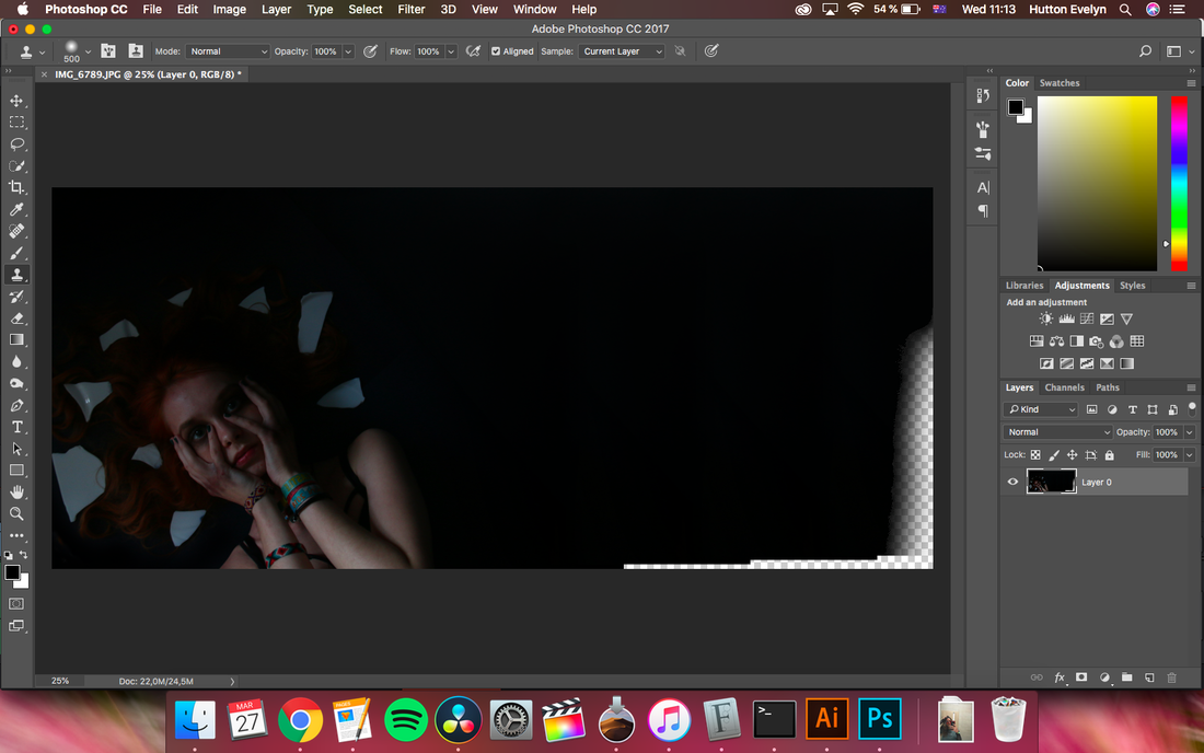
For the completion of the minor task, I made a website dedicated to the artist I chose this year, Sevdaliza. On there, I was advertising her album 'The Suspended Kid' as the newest one, and I created a 'fake tour' that she will be doing in Europe. I chose to work on Wix, which allowed me to be more creative with the template. I had many options of fonts, background images and videos, overlays, and I could put any element wherever on the page. As mentioned in the blog post about the fonts, I got inspired by the actual ones on her website, and the way the writing is framed in rectangles. At first, I wanted to have some abstract sculpture figure add-ons, inspired, again, by her website. I downloaded some pictures of sculptures that I afterwards learnt how to edit in Photoshop: cutting, making the background transparent, playing with the colors and sharpness etc. It was quite a tedious process, but I learnt many useful skills that I will surely need in the future. 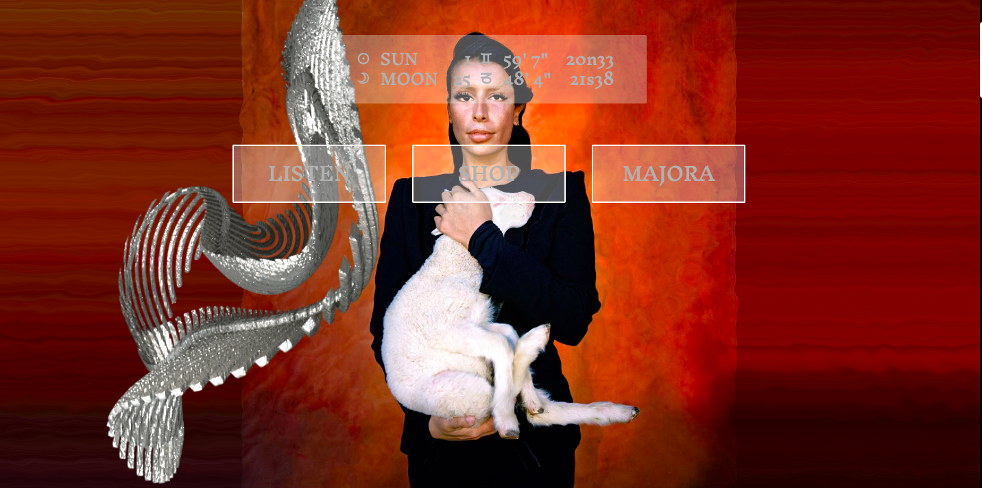 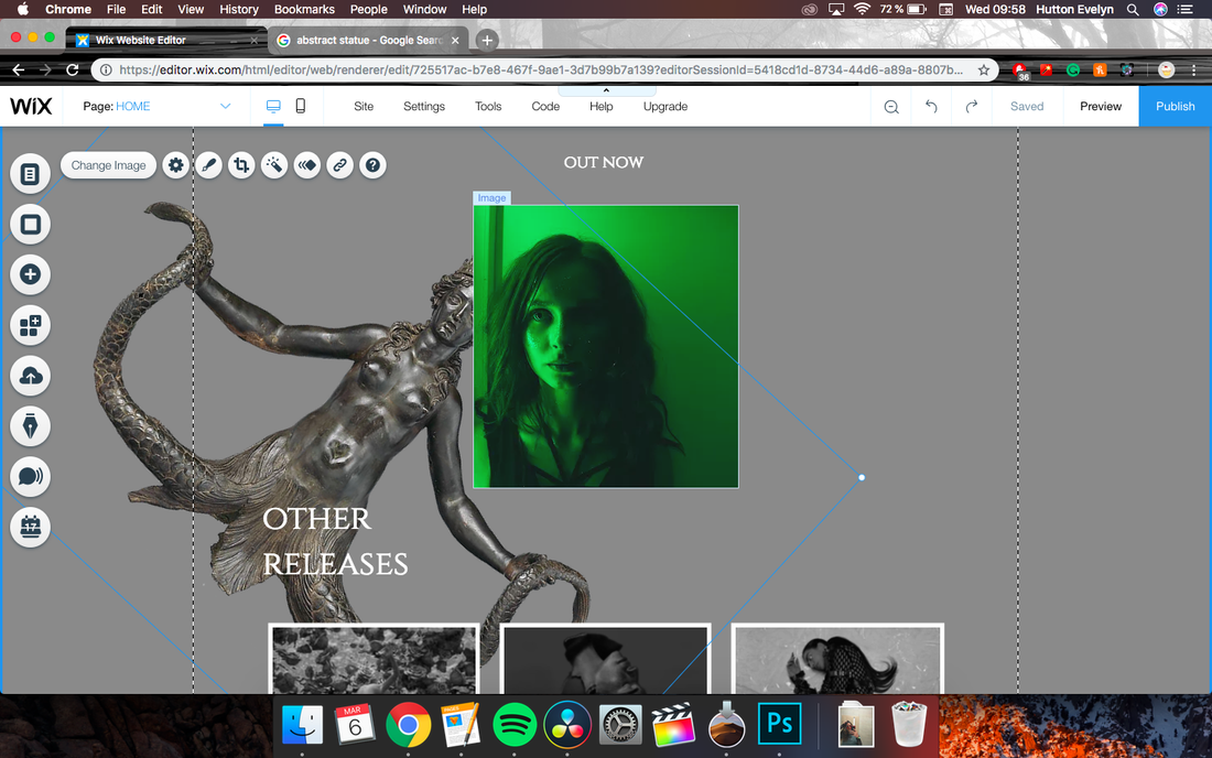 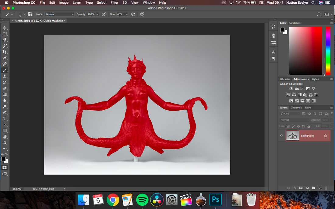 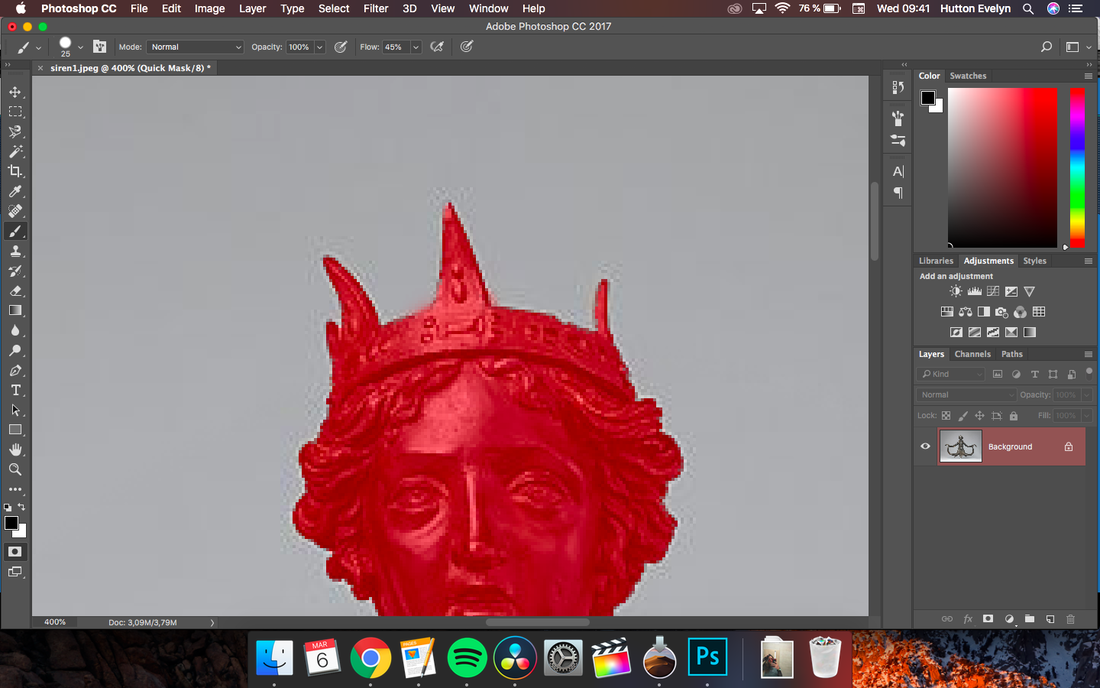 A problem that I encountered in the creation process was that the png images still had some white background left around the edges, and it was quite visible, making them look very amateurly edited, so I brought them back into Photoshop and cut more, as well as softened the edges. The change can be seen below, the left png still has the white edges while the right one was refined. 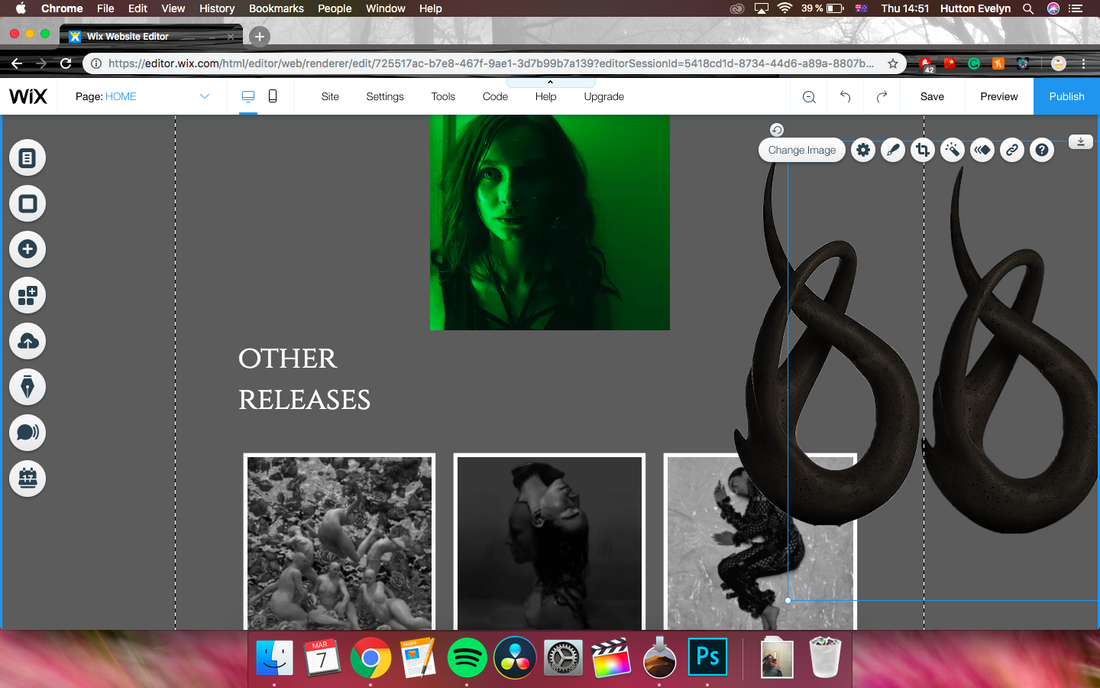 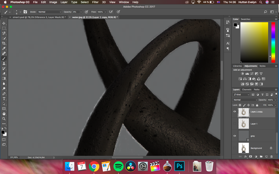 As for the overall look, I chose stick with the theme of desaturated, darker colors, that macthes both the video and the digipak. For the background that the audience first sees on the website, before scrolling down, I have a video of moving waves with a black grid overlay. The waves represent the symbolism of the sirens and the Caspian sea, white the overlay was chosen to add a bit of surrealism to the look.
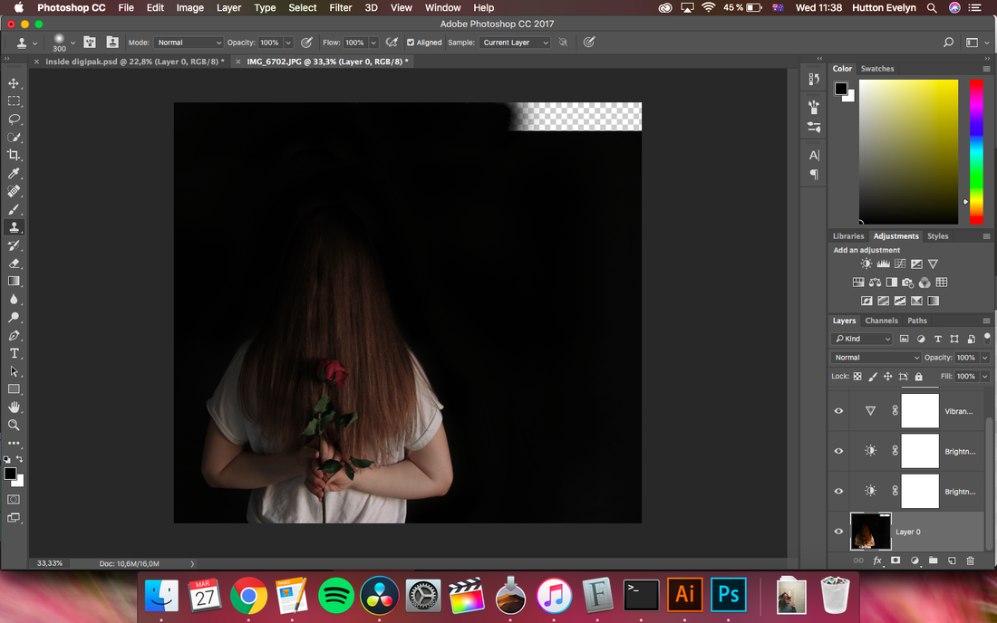
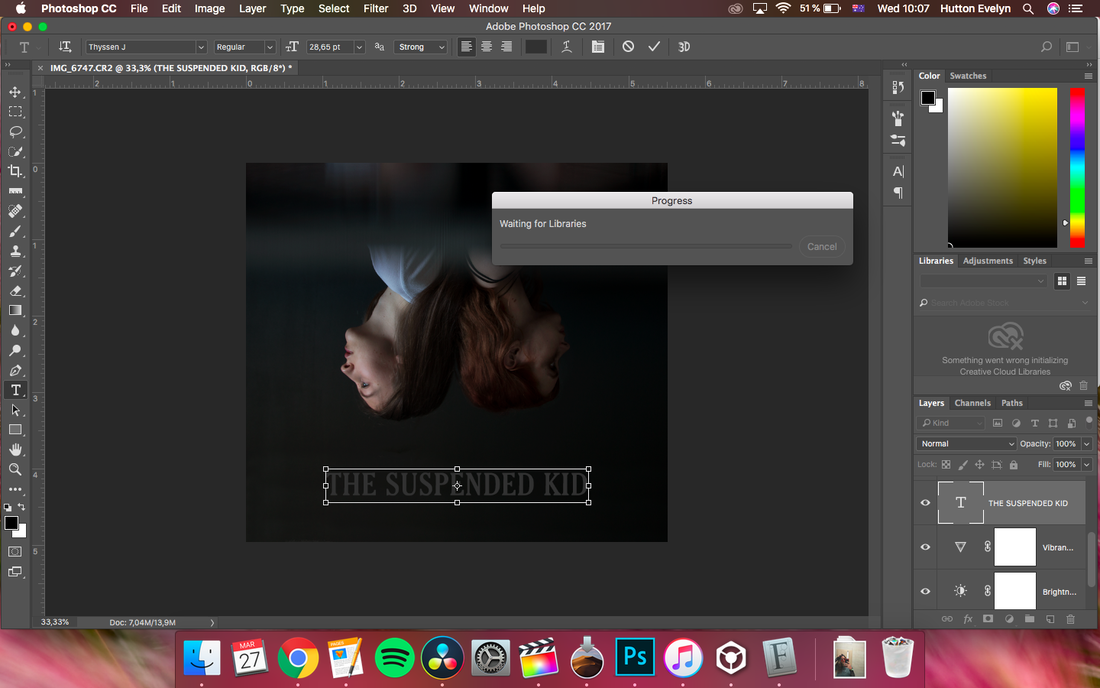
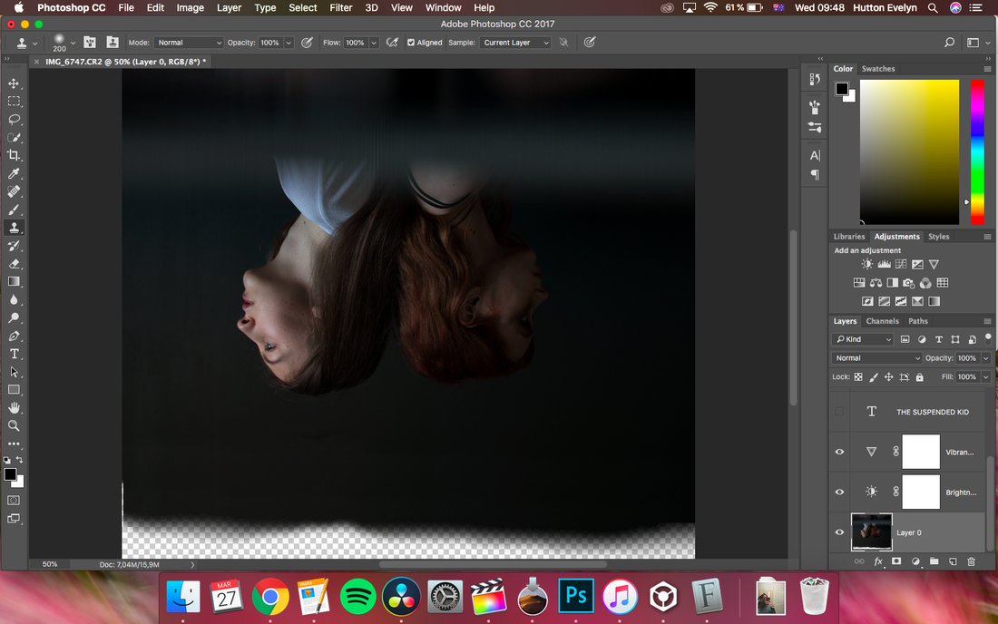
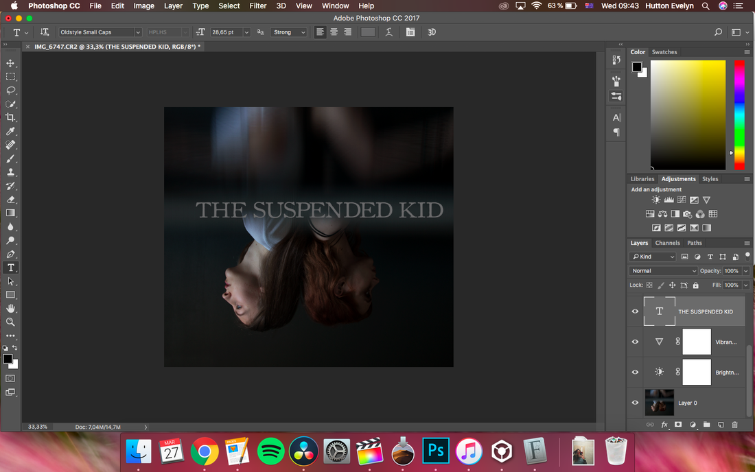
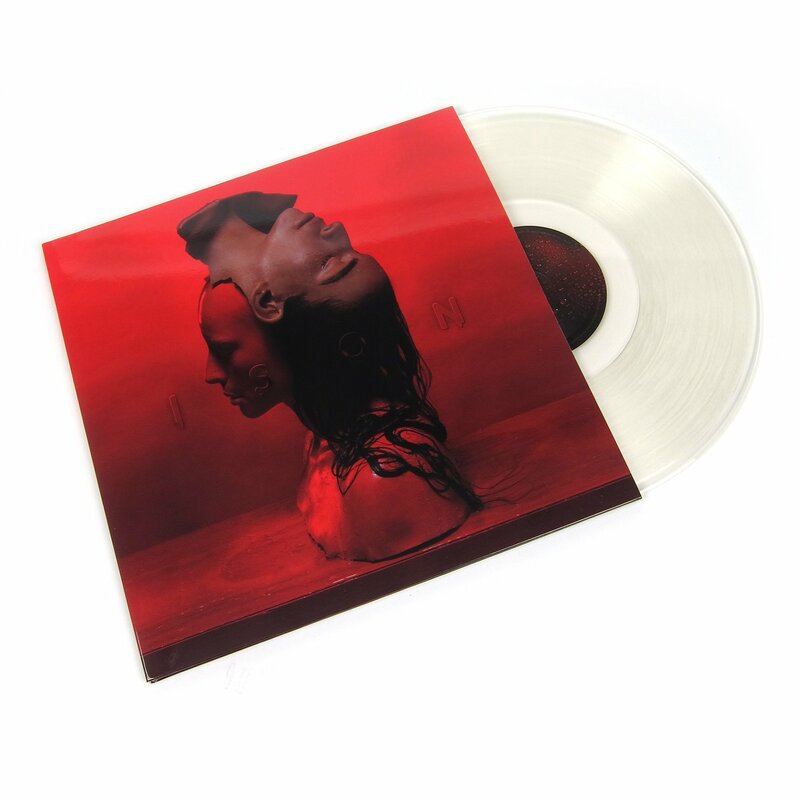
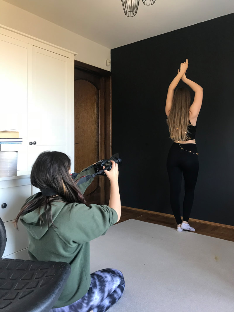
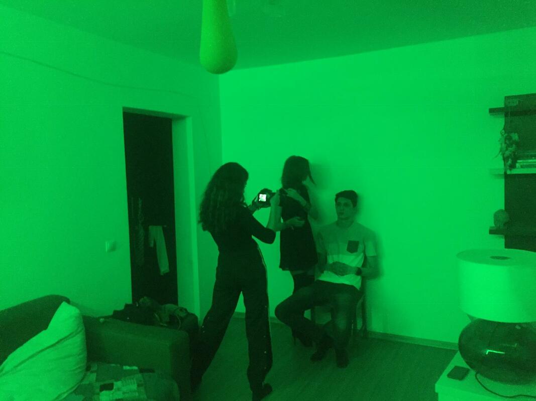
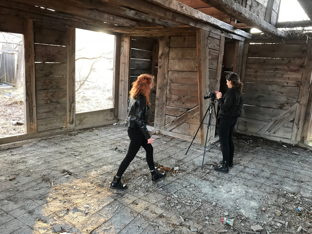
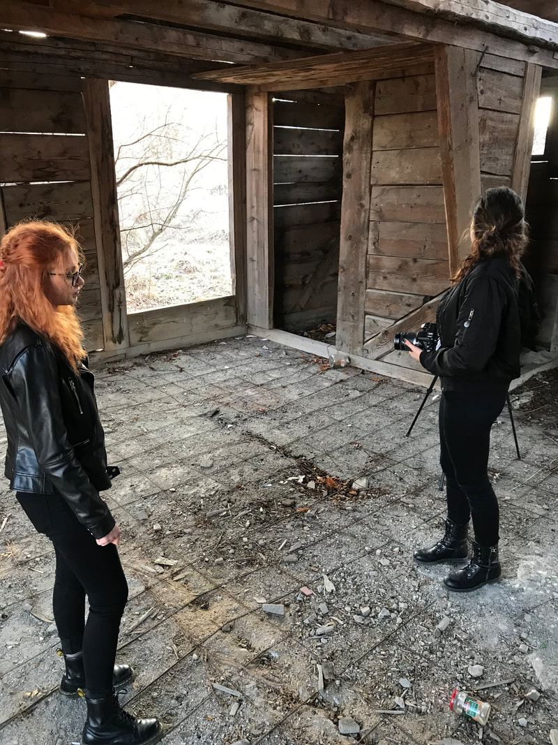
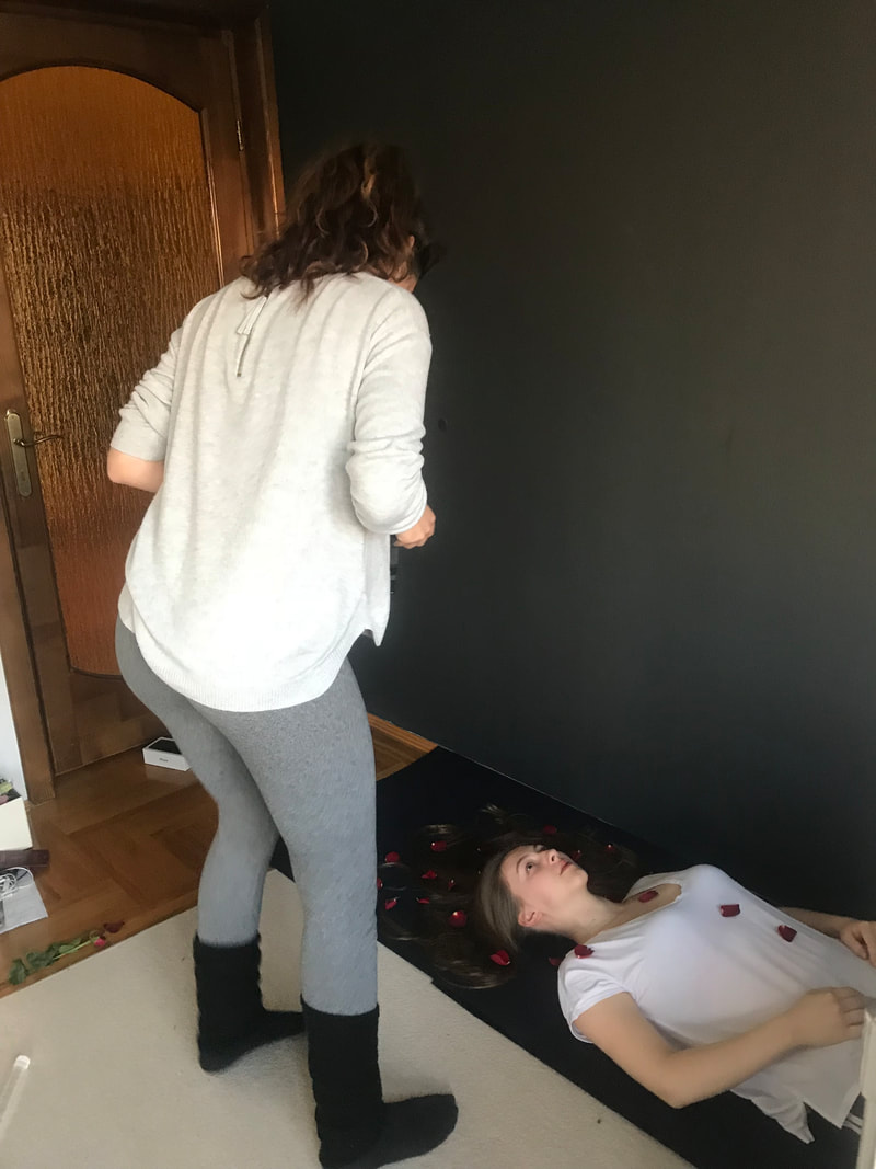
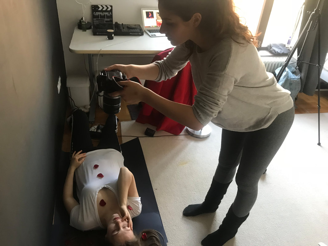
Overall, I would say it was a challenging experience, that I throughly enjoyed, and am looking forward to creating another actual website in the forthcoming times. The button below directs you to the website! For my digipak I had a separate photoshoot with the girls, having the broken plate and a rose as props, being symbols from my music video. I noted down a few types of shots I wanted to look, after which I branched out, also taking into consideration their suggestions. I used the programmes from the Adobe package, Photoshop and Illustrator, and learnt a lot of new tools and tricks. For example, I learnt about the burn and dodge tools in Photoshop, and about the clone stamp. I took some screenshots of when I was using this tool, as it surprised me how easily it can be done, and helped me immensely when creating the images. I chose the picture with the girls, with the prism held in front of the camera, rather than the ones where only one of them is captured because I felt like both of them have the same importance in the story of my music video, and are both present in all of us, a sort of a 'yin-yang' perspective. I decided then to flip it because I also saw Sevda do this in some cases, for her 'Ison' album cover for instance (which I inserted below), and I also have flipped text on my website, plus the more surreal look it adds to it. The prism held in front of the camera tried to mimic an 'underwater' look, as the song itself has the name of a sea in it, so the girls basically look submerged in water. The last picture is of a draft of the cover, where I used another font than the current one, and didn't exactly know why I didn't like the outcome, it just didn't look very real or professionally made. After playing around with the fonts and positioning of the text, elongating the image, and putting the album title and name of the artist on the blank space, it turned out great. This is the final one. I am very satisfied with how it turned out, and can definitely say it matches the overall theme I wanted to create.  When choosing the fonts, I used the site 'Dafont.com' for finding one that suited the brand created. After the research done on Sevdaliza's fonts, from her website and album covers, I saw that she tends to go for serif fonts, so I did the same. I typed the name of the album itself rather than only looking at the fonts with different text, so I could really see how it will look like. This first one seemed like a good idea initially, but I decided I didn't like the way the 'S' looked, and as I wanted it to look exactly like I imagined, I decided to look for others.  This one was close to being the final cover, but after consulting my teacher too, we thought that antoher font, which will be down below, looks better in this case.   The next one looks very much like the actual cover of her album, just with less spaced in between the letters. At first I though it would be good to mimick the cover at this level, but I though that it would be too much like hers, and too little from my input.  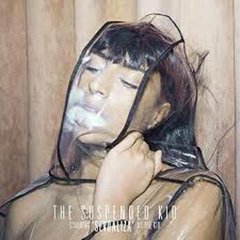 The font 'Assasin' also stood out to me, but I thought the letters were too big and spaced out, making the attention from the actual image from the cover to the font, something I didn't want to happen.  Finally, I chose the font 'Thyssen J' to be the font for my album cover. The 'T' looks very similar to the one visible on Sevdaliza's website, the font isn't too thin, rounded or bold, and it doesn't stand out too much, so I thought it was perfect.  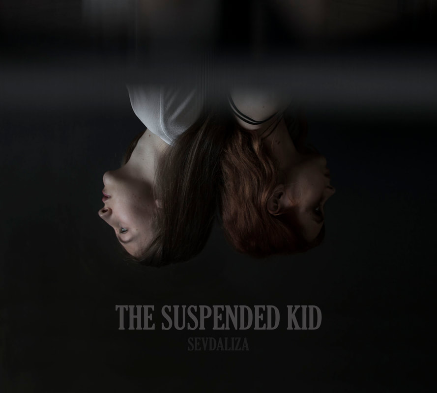 At each session I asked someone to take pictures of me while shooting, to show some of the behind the scenes. Each location and prop was thought and arranged by me, and thought I would show the effort put into the project thought these pictures. The shooting experience overall was better than last year, because I planned almost everything in time. For the film shootings, I had my script near, to help both me and my actors, and to know what types of shots I need, and what part of the lyrics I wanted the girls to lip-sync. Furthermore, I only shot in places that I didn't need any approval for, such as my home, a friend's place and an abandoned house, so it made the pre-work easier. Knowing how to use the camera better also aided my workflow, in addition to having a tripod to use. After putting all the shots I wanted to use together, I exported them as a rough cut version of the soon to be music video. After viewing the it, I saw that the clip had 20 minutes, as I was very confused as to why, and more than 15 minutes were blank. I checked the exporting settings, and the curser was set very far from where the video actually ends, so it saved it as a whole 20 minute clip. The format chosen was also not the right one, being too long and thin. These mistakes were done as I didn't know the software well enough, but I was happy I made them with this unedited version, because I now know what to do differently. When I first started to work on the project I was still using Final Cut Pro, and cut only the parts with Francesca dancing, after which I moved my platform to Da Vinci Resolve. What I did then was export the clips with Francesca, added them to the new platform, and cut them again, as I had a lot of footage I didn't want to use, due to it being too repetitive or redundant and long. An I issue I encountered was that these clips showed as 'media offline' in my timeline, so I saved the version where this is visible, in order to show that the editing process can be long, and many unexpected problems may arise. At first I thought I had to cut each part of the long video with her dancing again, but I figured out a way to just replace the 'media offline' clips with the right ones again by clicking 'relink selected clips' in Da Vinci, and adding that exported whole video again to the media pool, and the cuts I made stayed the same, so it saved me a lot of time. After shooting all scenes, I started choosing with care the shots I wanted in my video, but my teacher advised me to only look in the media timeline on Da Vinci, and put the shots directly onto to song, to ease my work and to be more effective. The beat match wasn't a big problem, only in some cases where I had shots that lasted a few seconds, I needed them to be longer in order to match the music, but I figured it out by either shortening them and adding another one in the seconds left or move them onto another part of the song. Further on, I plan to color edit my shots with green and red, and play around with the exposure to make them look bright enough but not to bright, to also match the darker theme of Sevdaliza. |
AuthorWrite something about yourself. No need to be fancy, just an overview. Archives
May 2019
Categories |

 RSS Feed
