|
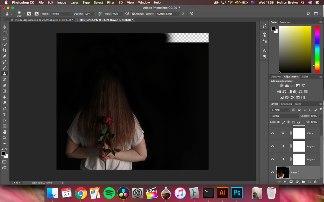
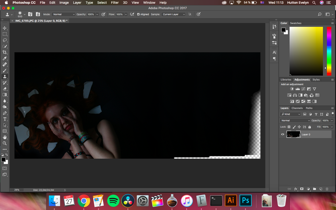
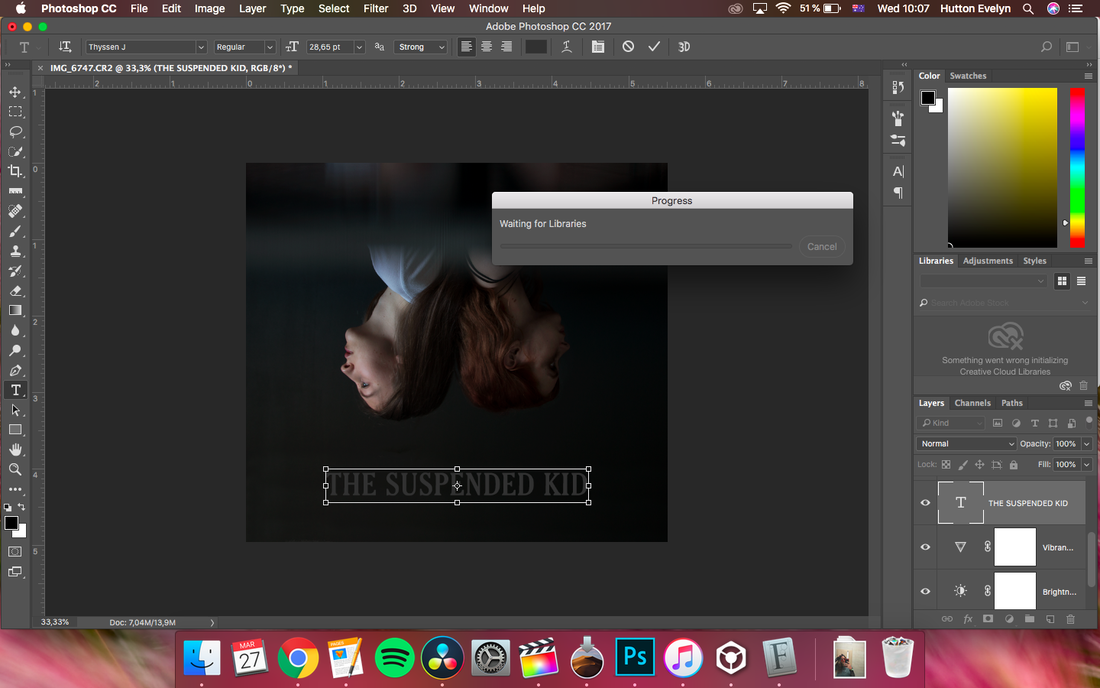
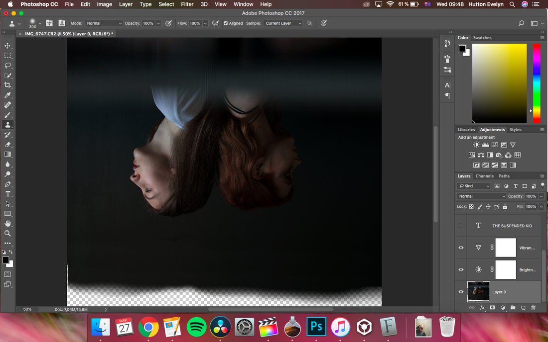
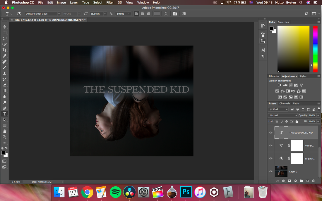
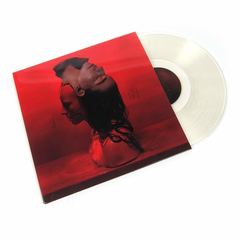
For my digipak I had a separate photoshoot with the girls, having the broken plate and a rose as props, being symbols from my music video. I noted down a few types of shots I wanted to look, after which I branched out, also taking into consideration their suggestions. I used the programmes from the Adobe package, Photoshop and Illustrator, and learnt a lot of new tools and tricks. For example, I learnt about the burn and dodge tools in Photoshop, and about the clone stamp. I took some screenshots of when I was using this tool, as it surprised me how easily it can be done, and helped me immensely when creating the images. I chose the picture with the girls, with the prism held in front of the camera, rather than the ones where only one of them is captured because I felt like both of them have the same importance in the story of my music video, and are both present in all of us, a sort of a 'yin-yang' perspective. I decided then to flip it because I also saw Sevda do this in some cases, for her 'Ison' album cover for instance (which I inserted below), and I also have flipped text on my website, plus the more surreal look it adds to it. The prism held in front of the camera tried to mimic an 'underwater' look, as the song itself has the name of a sea in it, so the girls basically look submerged in water. The last picture is of a draft of the cover, where I used another font than the current one, and didn't exactly know why I didn't like the outcome, it just didn't look very real or professionally made. After playing around with the fonts and positioning of the text, elongating the image, and putting the album title and name of the artist on the blank space, it turned out great. This is the final one. I am very satisfied with how it turned out, and can definitely say it matches the overall theme I wanted to create. 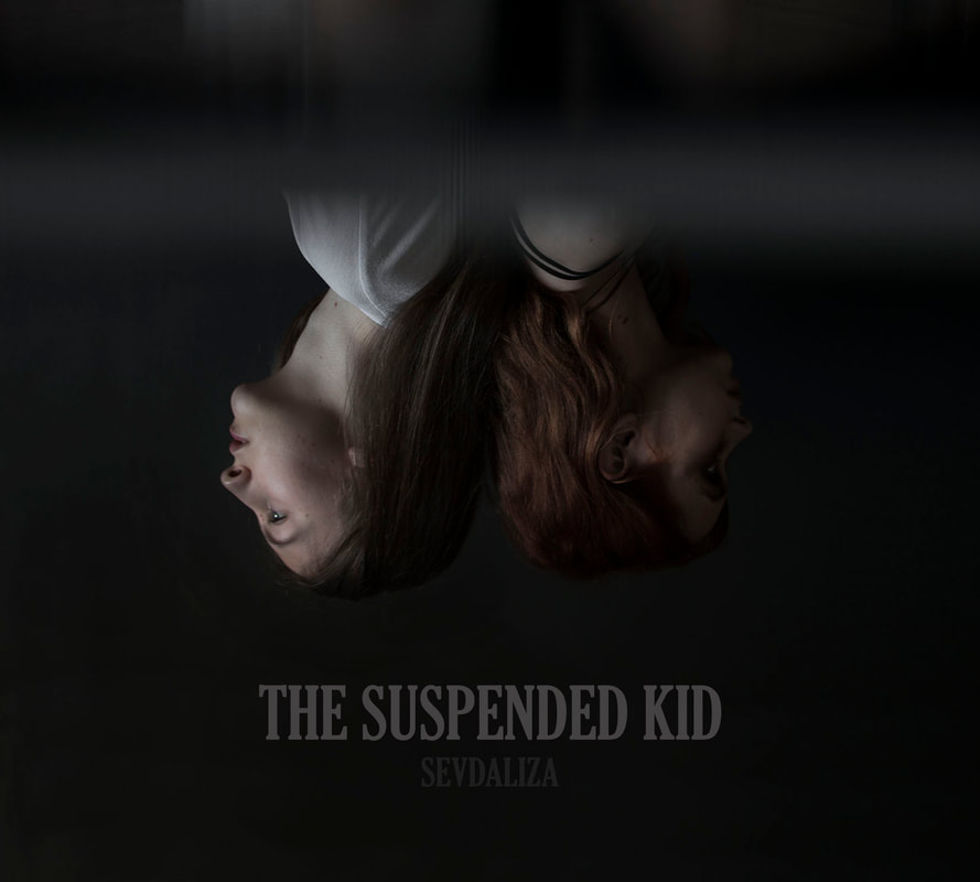
0 Comments
Leave a Reply. |
AuthorWrite something about yourself. No need to be fancy, just an overview. Archives
May 2019
Categories |
 RSS Feed
