|
When choosing the fonts, I used the site 'Dafont.com' for finding one that suited the brand created. After the research done on Sevdaliza's fonts, from her website and album covers, I saw that she tends to go for serif fonts, so I did the same. I typed the name of the album itself rather than only looking at the fonts with different text, so I could really see how it will look like. This first one seemed like a good idea initially, but I decided I didn't like the way the 'S' looked, and as I wanted it to look exactly like I imagined, I decided to look for others.  This one was close to being the final cover, but after consulting my teacher too, we thought that antoher font, which will be down below, looks better in this case.  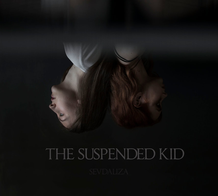 The next one looks very much like the actual cover of her album, just with less spaced in between the letters. At first I though it would be good to mimick the cover at this level, but I though that it would be too much like hers, and too little from my input.  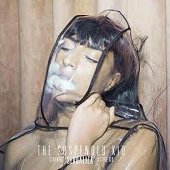 The font 'Assasin' also stood out to me, but I thought the letters were too big and spaced out, making the attention from the actual image from the cover to the font, something I didn't want to happen.  Finally, I chose the font 'Thyssen J' to be the font for my album cover. The 'T' looks very similar to the one visible on Sevdaliza's website, the font isn't too thin, rounded or bold, and it doesn't stand out too much, so I thought it was perfect.  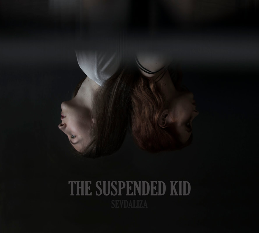
0 Comments
Leave a Reply. |
AuthorWrite something about yourself. No need to be fancy, just an overview. Archives
May 2019
Categories |
 RSS Feed
